
5 Winning B2B Marketing Thank You Pages
A common mistake many B2B marketers fall into is not placing enough emphasis on ‘thank you pages’. Someone (hopefully a prospect) has just downloaded a piece of content from your website, input some personal information.
Many companies believe the work is done, but what about acknowledging or thanking the prospect for downloading the information? We (B2B marketers) know better than this - And recognise that thank you pages are a great way to build trust with the prospect, offer them the chance to learn more about your company, and encourage them to continue exploring our website, among other things.
What is a thank you page?
A Thank You page is a page that aims to keep your audience engaged after they’ve completed a certain action. For example, after they give you their contact information in order to download content or sign up for a demo. The page provides information as to what the next steps are, as well as thanking the user for accessing/downloading the content. Thank You pages are the perfect opportunity to guide your leads down the funnel by offering them the chance to read your blogs, download other content offers or even scheduling a demo. Do your Thank You page right, and your leads will trust you and convert more often to customers!
3 reasons why thank you pages are essential for B2B marketing
So now that we know what a thank you page is - let’s look at some of the key benefits of creating one.
- Analytics - B2B marketers LOVE analytics! Thank you pages make it easy to track conversions (form submissions, downloads etc) as the cookie associated with each page will fire every time somebody lands on the page, signaling a download.
- Build a human connection with your audience - Thank you pages provide a great way to humanize your brand, by thanking your audience for completing a specific action on your website. As we know, building audience trust is a crucial step in the buyer's journey.
- Upsell your product/service or continued navigation - Thank you pages also offer the perfect opportunity to continue interacting with your audience by highlighting additional content or blogs on your website that might be of interest
See how to get started with inbound marketing here.
5 real-world thank you page examples
Now that we’ve explained the importance and benefits of a Thank You page - Let’s look at what a good example of a B2B cybersecurity thank you page actually looks like? Here are 5 of our favorites.
- Varonis
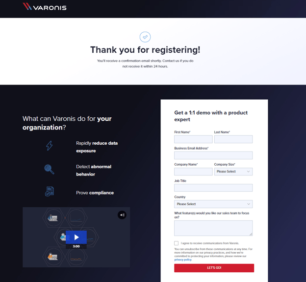
This is a great example of a well-designed, thoughtful thank you page from cyber security giants Varonis. The page is from an upcoming webinar, and provides you the option to watch a demo video, have a 1-on-1 demo with a member of their team, as well as laying out in a clear, concise manner what Varonis can do for your business. Simple, but effective. - Nuvei
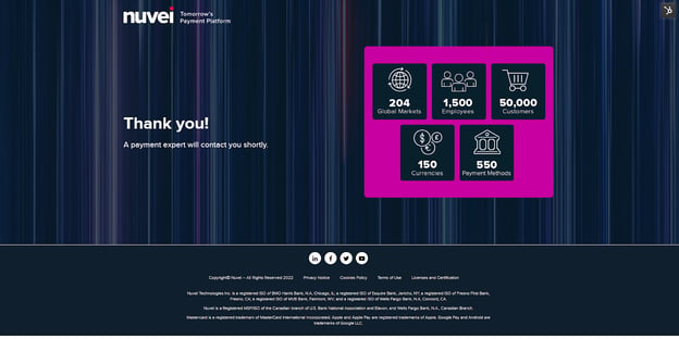
This landing page for Nuvei is different in the sense that instead of the customers requesting a particular piece of information, instead, the customers have contacted the business for partnership or merchant opportunities. The thank you page outlines the next step in the process, highlights some key benefits of choosing Nuvei, and offers navigation back to the main site as well as social media links.
- Fortinet
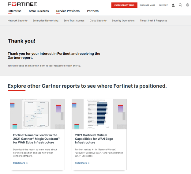
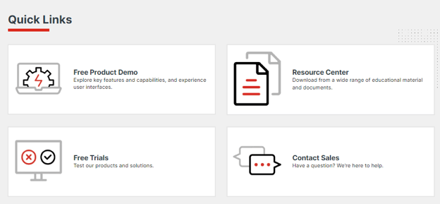
This Fortinet thank you page achieves several goals simultaneously - Not only does it send the requested piece of information, it also offers 2 additional, similar reports that may be of interest to the user. In addition, there is the option to continue the engagement beyond simply downloading other information - They also have product demos, free trials, and contact options. The page also offers full website navigation meaning the audience can continue their journey seamlessly.
- Envy
OK… It may be a shameless self-plug, but our cybersecurity benchmarks Thank You page is one of our favorite examples. It outlines how the content requested will arrive, as well as the option to follow up and book a consultation with our B2B marketing experts straight away, and engage/follow with us on social media.
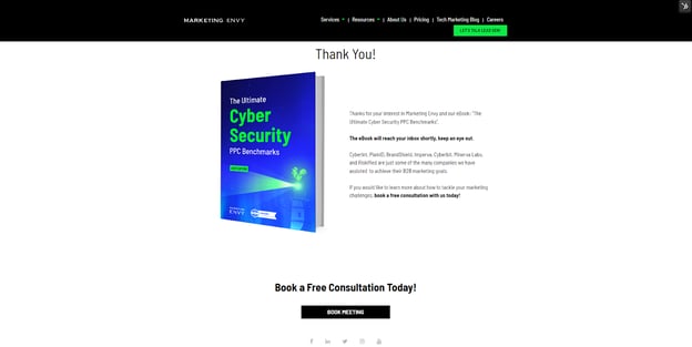
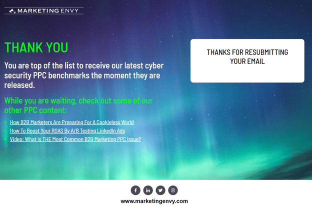
As you can see, the Thank You page we created enables users to continue engaging with Envy PPC content - In other words, content the users has already displayed an interest in!
- BrandShield
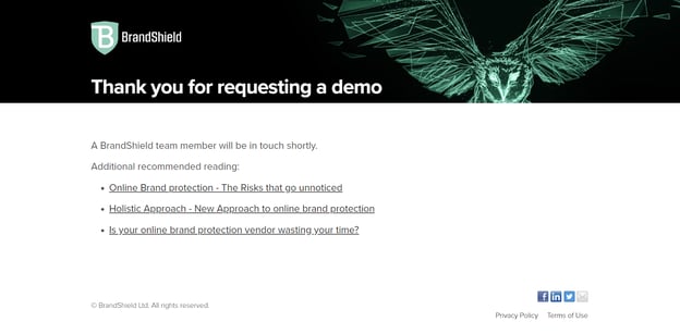 This is a simple, text only Thank You page. It notifies the users clearly what the next steps will be, and provides some nice, related content to the user to continue their website journey. The page also provides social links to allow the user to engage with/follow the brand on social media.
There you have it - 5 of our favorite B2B marketing thank you pages. Although these pages have varying designs, information and content, they all share several features:
- They allow for continued browsing on the website
- Offer additional steps to continue the customers journey
- Thank the user and outline how the content is to be received
Common thank you page mistakes
Now that we have covered some of the reasons why you MUST be using thank you pages for your business, as well as 5 real-world B2B examples, let’s take a look at some of the most common Thank You page mistakes you should avoid. While these mistakes are not critical to your overall marketing efforts, they will nonetheless hurt your overall performance.
- Inconsistent messaging: One of our pet peeves is when the Thank You page messaging does not match the landing page title. This can lead to confusion on your audiences behalf, as well as inconsistency for your messaging. And as we all know consistency is crucial to successful messaging.
- Making the prospect wait: There is nothing more frustrating than providing your valuable personal information, and not receiving the content you requested immediately. It is crucial that you structure your workflow in such a manner that your audience can immediately access the requested information, be it by email or automatically from the thank you page. Not having this functionality means that your content might arrive in their inbox at a subsequent, inconvenient time and be lost forever.
- Not testing your Thank You page: A/B testing is an important step in optimizing your marketing efforts. As B2B marketers, we do it for many other marketing activities so why not also on our thank you pages. Testing different types of follow up with content tailored to the buyer's specific stage in the customer journey can help you optimize your funnel and generate more leads… So make sure you are testing!
- Providing no additional information: Landing your audience on a particular Thank You page, without providing the audience with the opportunity to continue browsing related content - Be it relevant CTAs or demo requests, is a wasted chance to continue the interaction. Don’t miss an opportunity by ending the journey on the Thank You page. Instead, provide additional navigational options that are relevant to the content they requested and you will see your conversion rate increase significantly!
- Showcasing irrelevant content: Another Thank You page mistake that drives us crazy is when the content is not related to what was initially requested. It doesn’t make sense to show irrelevant content when you know exactly what the person is interested in. Optimize the content and nurture sequence, and you will see your conversions improve! For example if someone downloaded our PPC Benchmarks report mentioned earlier (wink wink), it wouldn’t make sense to talk about why email marketing is all you’ll ever need to succeed on the Thank You page.
- Not linking to your social profiles: Not providing the audience with the opportunity to follow/engage with you on social media from your Thank You page is a massive missed opportunity. When someone downloads a piece of content, there is always the risk that it never gets read, or gets lost as one of a million unopened emails… By enabling your audience to follow you on social media, you have the option to consistently remain in mind by wowing them with your kick-ass social media posts.
While these mistakes can be easy to make, they can also be easy to remedy. To make sure you’re not making these mistakes, here are some simple things you can do:
- Clarify your lead goals at this stage. Do you want them to consume more content? Get in touch with you?
- Ensure that you plan for a Thank You page that naturally takes leads by the hand and guides them to the next step
In short, Thank You pages are a must when providing downloadable content, signing up for a webinar, or even when requesting a demo. They are a great way to keep your prospects engaged and satisfied, as well as providing you with additional marketing opportunities to an audience that is obviously interested in your offering. To learn more about how to implement a winning content strategy that will have your customers wanting more, book a meeting with us today!


.png?width=352&name=Nuvei%20blog%20cover%20(1).png)

